Optimizing the Product Hub

The Challenge
The NETSCOUT Product Home Page was outdated and overwhelming. Users were met with a never-ending list of products with no clear information hierarchy, making it difficult to navigate, scan, or find relevant solutions efficiently.
UX Methods
Semi - Structured Interviews
Industry Design Pattern Analysis
My Role
UX Researcher
UX Designer
Length
4 Weeks
Project Objectives
To strengthen NETSCOUT’s product presence by creating a clear, user-friendly experience. The page needed to effectively showcase the product offerings, highlight key benefits, and guide users toward informed decisions.
The goal was to create a seamless and engaging journey that builds confidence in the solutions and reinforces NETSCOUT’s industry expertise
This would be done by:
Creating a structured, user-friendly layout that makes product exploration clear and intuitive.
Enhancing discovery and navigation by introducing featured products, category groupings, and a search section.
Improving browsing efficiency with a paginated 3x2 grid that organizes products into manageable sections.
Encourage engagement by providing multiple entry points that guide users to relevant products.
Research
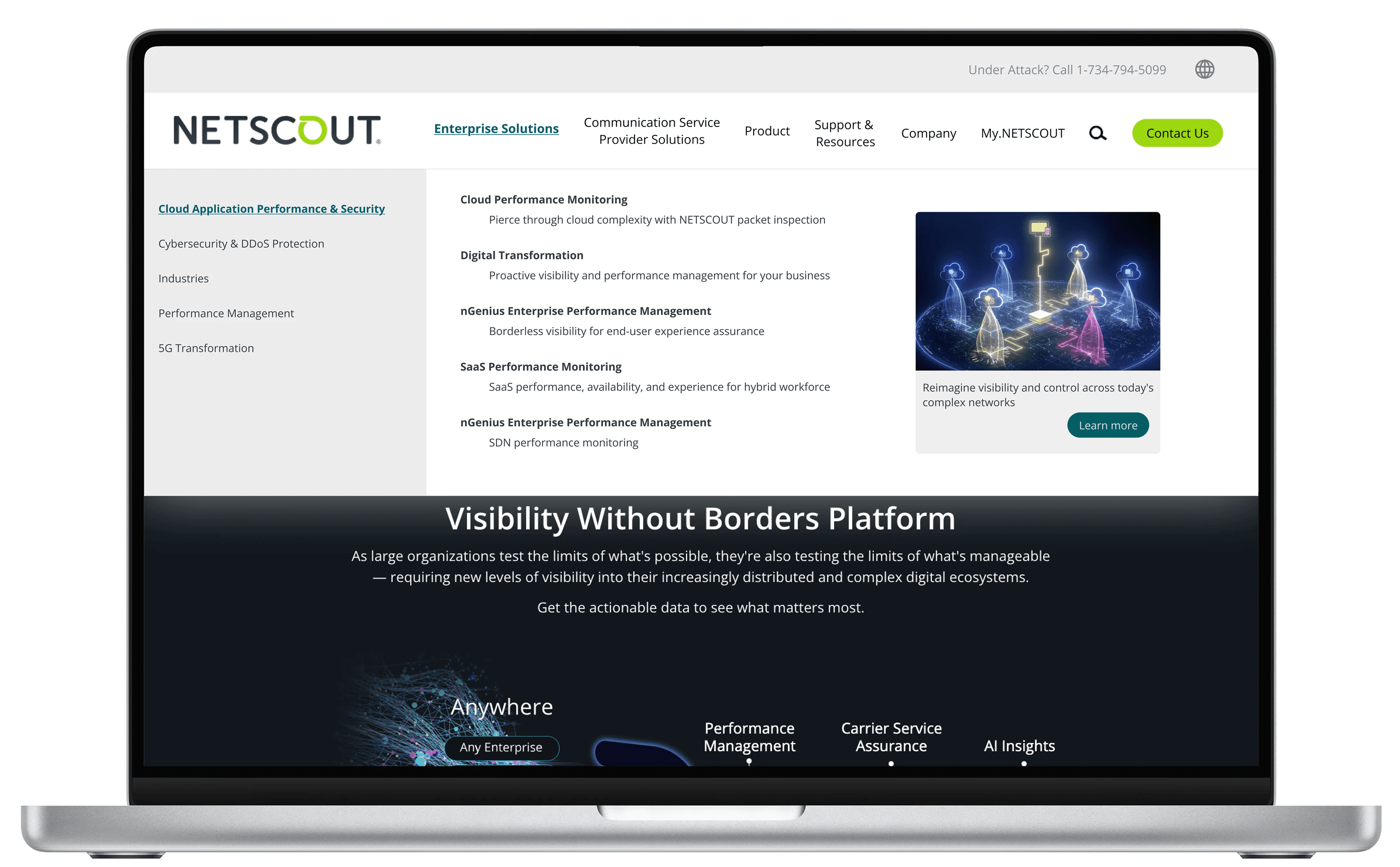
Top Half of Product Hub
Old Design

Bottom Half of Product Hub
Old Design

Interview 1
"I kept scrolling, but I had no idea how much more there was—after a while, it just felt endless, so I left the page"
Interview 2
"It was hard to quickly find what I was looking for. I wasn’t sure if I should use search, filter, or just keep scrolling"
Interview 3
"The design looks really outdated, like something from an old website, which made me question if the information was even up to date"
Semi - Structured Interviews Findings
Key themes from the interviews were very obvious:
Users struggled with the long, unstructured product list and were unsure how much further they needed to scroll.
The page felt out dated and made users question it's credibility and relevance.
There was a lack of organization and without clear sections/navigation cues, users found it difficult to locate products quickly.
Category Sections - Palo Alto Networks
A section where clients and users can easily browse products by their preferred category

Featured Products - Cisco
A dedicated space for clients and users to explore highlighted products, bestsellers, or new arrivals.

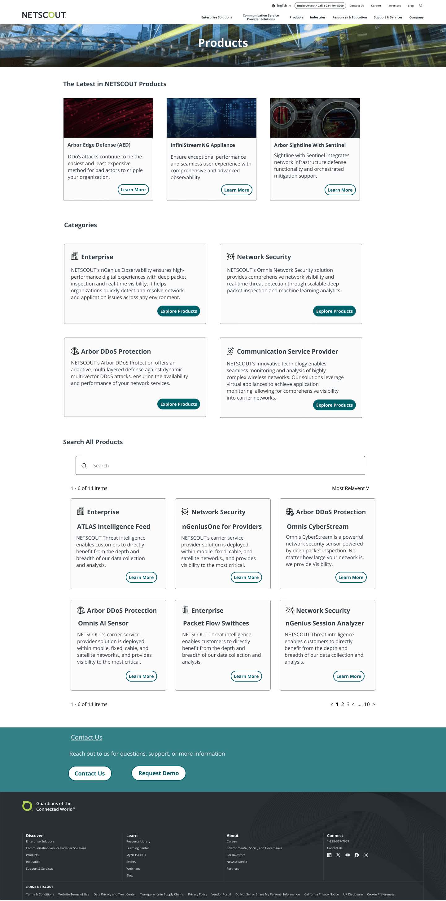
New Product Hub Page
Sections included: Featured Section, Categories, & Search All products
Old Product Hub Page

Feedback
I presented my designs to stakeholders to highlight progress and gather input for refinements.
The feedback was exceptionally positive, with many noting the dramatic improvement and expressing surprise that some of the newly included information had been missing in the original design.
Stakeholder 1: “The new layout is much more engaging and highlights key products effectively. I'd love to see how it impacts conversion rates”
Stakeholder 2: “I like how the structure is intuitive, and the navigation feels seamless. We should test how users interact with the "Search All” feature to ensure it meets expecations."
Stakeholder 3: “Comparing the before and after is really interesting. I was surprised to see that it used to be just a long list of products."
Next Steps
Track user interactions to identify which sections are most frequently used and optimize placement or content accordingly
Implement insights from user feedback and data analysis to improve the product page’s usability and effectiveness.