Mega Menu Redesign

The Challenge
NETSCOUT’s menu presented significant challenges, making its navigation inefficient and frustrating to clients.
The outdated design lacked a clear and consistent visual hierarchy, leading to a cluttered layout and made it difficult to locate information. Additionally, there was frequent confusion between clickable links and section titles, further complicating the user experience.
UX Methods
Usability Testing
Clickstream Analysis
Semi - Structured Interviews
Industry Design Pattern Analysis
My Role
UX Researcher
UX Designer
Length
7 Weeks
Project Objectives
Enhance the mega menu’s usability and visual appeal to drive user engagement and increase conversion rates, while aligning with key business goals of product discoverability and boosting site retention.
This would be done by:
Refreshing the design of the desktop mega menu to create a more modern, visually appealing, and user-friendly experience
Establishing a clear hierarchy within the mega menu to guide users toward key sections and improve overall usability
Ensuring there is consistent visual cues for titles and links to reduce misclicks and enhance navigation accuracy
Research
Old Mega Menu
Interview 1
“The menu is very cluttered and makes it overwhelming to me. I need to read a lot of to try and find what I need.”
Interview 2
“It’s overwhelming to see so many links in one place and hard to find what i’m looking for. Can you make it less overwhelming?”
Interview 3
“I kept clicking titles which I thought were links, but ended up not being links, and missing links that I thought were only titles.”
Usability Testing
Key themes from the usability testing were that:
Users found the mega menu cluttered and overwhelming, leading to confusion and difficulty navigating.
Inconsistent design of titles and links caused frequent misclicks, adding to their frustration and negatively impacting their overall experience.
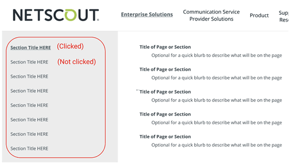
32 Links in One Section is Overwhelming
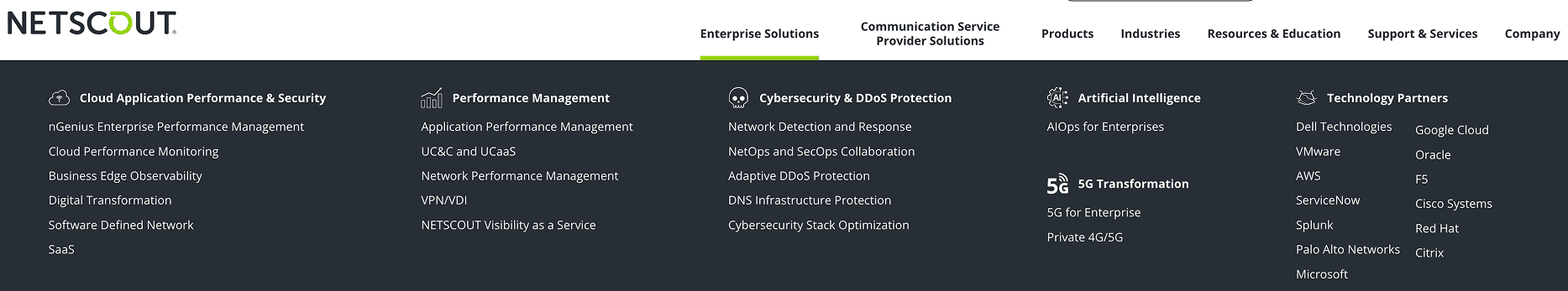
Titles Here Are Links
Product Menu Tab
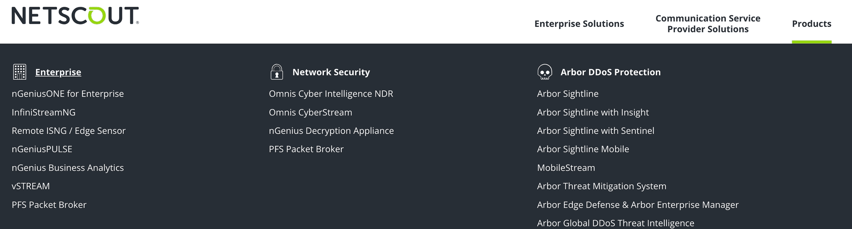
Titles Here Are Only Links
Enterprise Solution Menu Tab

Analytics Review & Findings
NETSCOUT’s mega menu has three levels with 121 links.
An analysis was conducted for one year’s worth of data using Google Analytics to determine if all links are equally used, and identify opportunities for improved visibility. The following key insights were uncovered:
Despite being nested in the third level of the menu, My.NETSCOUT emerged as the most-clicked link, with 6.4K clicks over the past year.
Users frequently navigated from the homepage to pages like About Us and Search, while only a small number accessed products and solutions pages through the menu.
Understanding Common Design Patterns
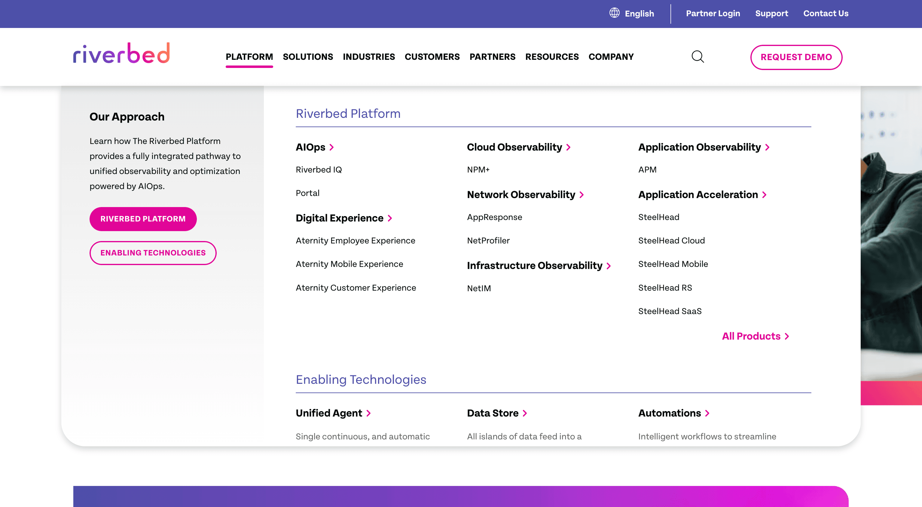
The structure of 11 competitor websites’s mega menu’s were analyzed such as Riverbed and Palo Alto Networks, identifying mega menu patterns while accounting for NETSCOUT's broader product range.
Key themes from the usability testing were that:
Users found the mega menu cluttered and overwhelming, leading to confusion and difficulty navigating.
Inconsistent design of titles and links caused frequent misclicks, adding to their frustration and negatively impacting their overall experience.
Mid-Project Constraints
Shortly after starting the project, it became clear that the mega-menu needed to be completed within three weeks for their annual Engage conference.
While a full redesign of the information architecture was ideal, time constraints led me to propose a focused visual overhaul, enhancing title scannability, refining link organization, and improving overall accessibility.
Understanding and Following the Brand Guidelines
Consistency in branding is crucial for maintaining user trust and recognition, ensuring a seamless experience across all touch-points.
In this redesign, modern UX improvements were introduced while adhering to brand guidelines, creating a solution that feels both fresh and familiar.
Creating a Cohesive Design Pattern Within Brand Guidelines
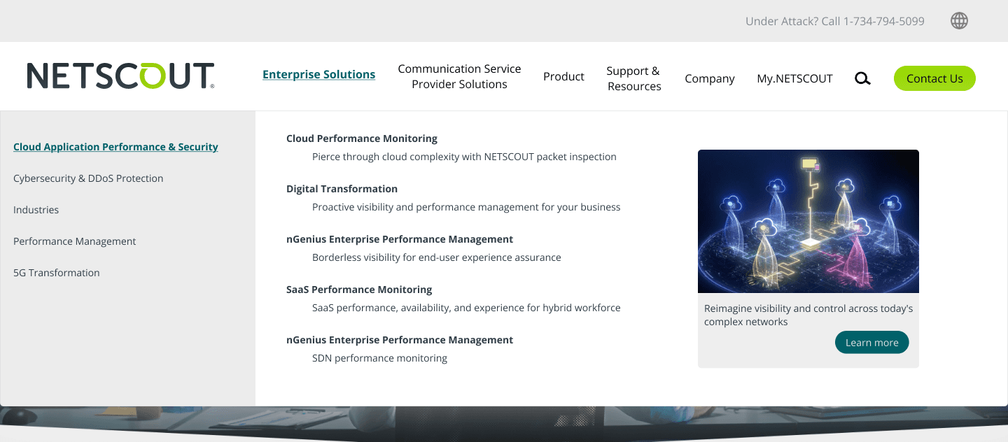
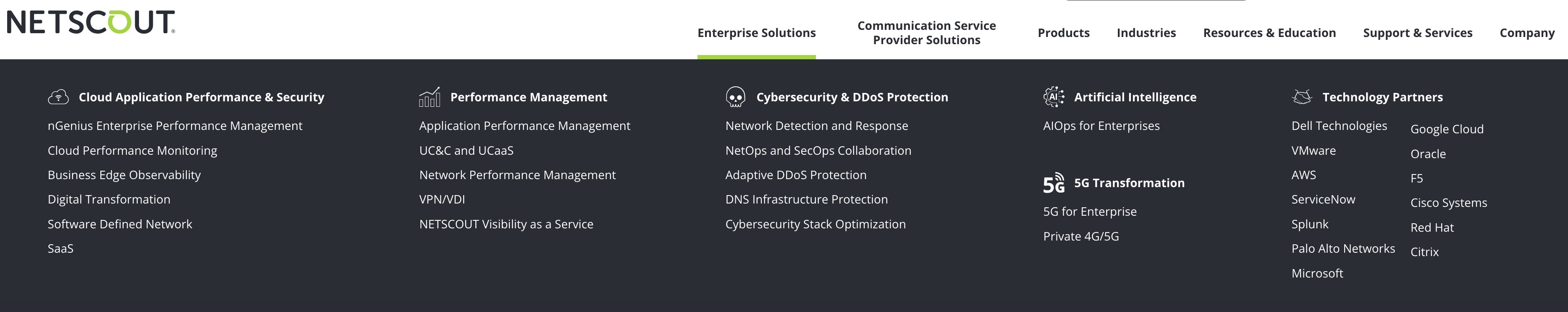
1 - Component: Left aligned mega-menu colum to display second level menu titles
Why: Establishes a consistent structure, helping users quickly locate and identify section titles.
What It Does: Reinforces hierarchy, improving overall readability and accessibility.
2 - Component: Third level mega-menu titles with brief explanation of the section

Why: To users with clear context about each page, helping them understand its purpose at a glance.
What It Does: Combines a concise title and description to guide users, improving navigation and decision-making.
3 - Component: Featured section to highlights key content or updates

Why: Draws attention to essential content, ensuring users engage with high-priority information first
What It Does: Highlights priority information, guiding users to key details and improving overall engagement
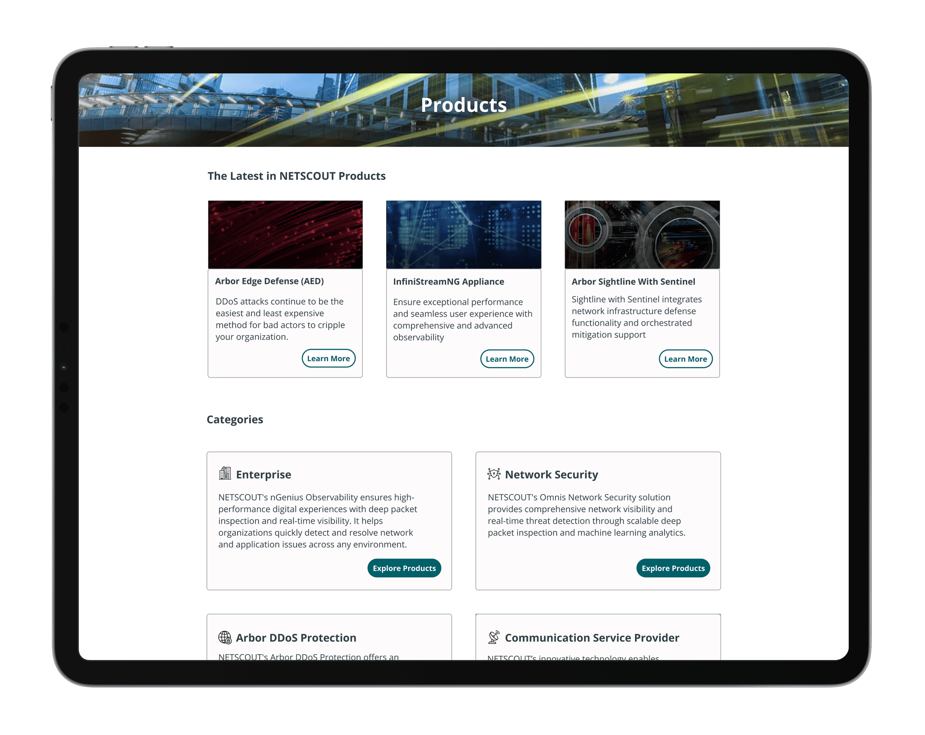
New Mega Menu
Old Mega Menu
Feedback
Before my departure from the internship, the work was presented to the stakeholders to showcase my progress and gather feedback for potential improvements.
The response was overwhelmingly positive, exceeding expectations, with many noting the striking contrast between the old and new designs.
Stakeholder 1: “This redesign not only enhances usability but also elevates the overall professionalism of our platform. It’s a significant improvement that aligns perfectly with our audience's needs. Thank you”
Stakeholder 2: “The difference is night and day – the new design is far more user-friendly and visually appealing.”
Stakeholder 3: “I was really impressed by how you took our goals and turned them into a solution that’s both practical and aligned with our brand.”
Next Steps
Present usability findings to Stakeholders and iterate based on their feedback and business objectives.
Conduct A/B tests to compare the new mega menu with the previous design and evaluate usability and engagement